The Secret Ingredients of a Great Wrap Design? Think Like a Chef
Ever wondered what makes a wrap design truly memorable? Why some cars turn heads instantly while others fade into the background? As a designer, I’ve been asked this many times – and my answer is always the same: great design is like a perfect recipe.
When I cook, especially when I marinate meat, I always balance four core flavors: fat, acid, sweetness, and salt. You can mix and dose them differently, but those elements are always there. The final result depends on how you balance them.
Guess what? In wrap design, it’s exactly the same.
What Are the "Flavors" of a Wrap Design?
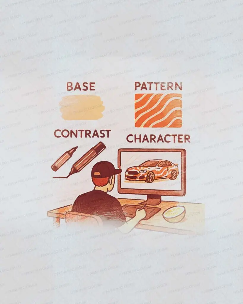
In every wrap design I create, I work with four essential ingredients:
- Base – The foundation or background of the design (like a bold color or a clean texture)
- Contrast – Elements that break the monotony and bring rhythm or direction
- Character – A distinctive trait that tells a story: a pattern, a logo, a custom detail
- Finish – The final touch that changes the perception: glossy, matte, brushed, reflective
Let’s say I’m designing a car that needs to look aggressive. I’ll increase the “contrast” element – maybe sharp graphics or a powerful logo with strong direction. If the goal is elegance, I’ll reduce contrast, focus on flow, and choose a refined finish.
Just like a dish, the magic is in how you dose each element.
Designing Isn’t Guesswork. It’s a Recipe.
- Who is the client? What do they like?
- What’s the main goal—visibility, branding, uniqueness?
- What are the limits—vehicle shape, surfaces, colors, budget?
Real Example: AronAir FR – Culture, Music & Duality
One of the most rewarding projects I’ve worked on is AronAir FR – a Seat Arona completely transformed with a custom wrap inspired by Mexican culture and music.
The base of the design? A dual narrative. One side of the vehicle embraces a masculine tribal energy, while the other represents a feminine, elegant spirituality. This visual duality became the foundation—the base flavor of the entire design.
The “contrast” came from the interplay of symmetrical graphics and mirrored layouts, applied with high precision across complex surfaces. These lines weren’t just decorative—they carried symbolic meaning and emphasized the concept of unity through difference.
For “character,” I infused the wrap with custom elements: skull motifs, musical symbolism, and subtle geometric patterns that paid homage to Día de los Muertos and cultural heritage. Each icon had a reason to exist. Each detail added depth.
And the “finish”? A high-gloss laminated wrap that made the vivid colors pop in the sunlight. The vehicle became a mobile celebration—an extension of its owner’s identity, complete with custom wheels, interior details, and show-level presence.
When we parked it at events, people didn’t just look—they came over to ask questions, take photos, and share stories. That’s what great design does: it connects.
Good Wrap Design is All About Balance
So, next time you look at a great car wrap, don’t just ask what it shows – ask how it was made.
The answer is in the invisible balance between base, contrast, character, and finish.
Whether you’re a car lover, a business owner, or a fellow creative, remember: design is not decoration – it’s expression. When done right, it leaves a taste you can’t forget.
📌 Want to know how your idea could taste as a wrap design? Explore real projects and get inspired