Color Perception, Finishes, and Real-World Differences in Wrap Design
The Color You See Is Not Always the Color They See
Every monitor is different. Brightness, contrast, resolution, and color calibration all impact what a color looks like. A color that looks bold and vibrant on a MacBook Pro may appear dull or muted on a generic office screen. That’s why sending mock-ups to clients always comes with risk: we never know what they’re actually seeing. A display set to high brightness may make the graphics look washed out; a dim screen might make everything seem too dark.
This matters even more when:
- The design features large areas of flat color
- The client has a strict brand palette
- The visual identity demands minimalism and precision
In complex graphics full of texture, shadows, and color variety, these shifts are harder to notice. But in flat designs with clean blocks of color, they can really stand out.
Printing Complicates Things Further
Even after final approval, things change again in print. The RIP software (Raster Image Processor) that prepares files for the plotter can slightly alter color interpretation based on:
- The print profile
- The printer model
- The ink type
And here’s a detail most don’t consider: the print direction. If the hood and fender are printed from different rolls or orientations, you might end up with color shifts at the panel joints due to how the material absorbs ink depending on feed direction.
The Vinyl Makes a Difference
The vinyl itself plays a huge role. Not all “white” vinyls are the same. Different brands have slightly different base tones and absorb ink differently:
- Standard white vinyl vs. metallic printable vinyl (which starts from a grey base)
- Glossy vs. matte vs. satin laminates
These finishing choices can warm up or cool down a color, make blacks look grey, or reduce contrast overall. The same design printed on two different materials can look like two different wrap jobs.
So, How Do We Fix This?
We use two key methods to keep things under control:
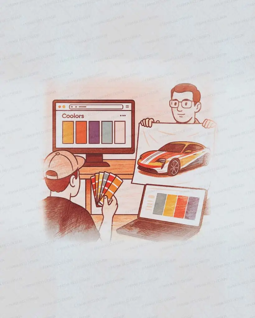
- Color Reference via Digital ToolsWhen there’s no strict guideline, we invite clients to pick from trusted color palette platforms (like Coolors or Adobe Color) that use universal HEX/RGB values. This sets a shared digital reference point.
- Real Print Preview (TPF: Test Print File)Before finalizing the project, we offer a printed test with actual vinyl and laminations. It includes key parts of the design, so the client (and wrapper) can see real-world color, alignment, and finish. It’s not just useful. It’s peace of mind.
Always Talk About It First
Want to know more about how a graphic becomes a wrap? Listen to our podcast Under the Wrap Design, where we dive deep into the creative process, challenges, and real-world decisions behind each project.
Ready to bring your wrap project to life?
Want to explore How to Choose the Right Wrap Design for Your Vehicle? Click here ⧉